Data Blocks and Visualization Objects
To build Dashboards, you drag the following types of data blocks and visualization objects from the Toolbox to the workspace, defining each object's properties, and linking them. The following data blocks and visualization objects are available for building dashboards.
Data Blocks
The following sections explain the available data blocks.
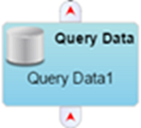
Query Data
Retrieves data based on a SQL query and makes it available to a grid or other visualization objects.
For more information, see Defining a Query Data Block.
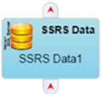
SSRS Data
Retrieves data based on a SQL Server Reporting Services report.
For more information, see Defining a SSRS Data Block.
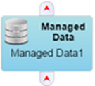
Managed Data
Retrieves predefined data blocks that are not generally available through database queries.
For more information, see Defining a Managed Data Block.
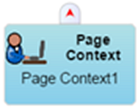
Page Context
Exposes information about the current context. For example, the current user name, time zone, and browser information. It can also be used to define page parameters that can be set from other dashboards or external links.
For more information, see Defining a Page Context Data Block.
Data Control Blocks
The following sections explain the available data control blocks.
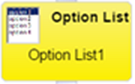
Option List
Presents a list of options to the user through a drop-down list and have the selected item be made available as output.
For more information, see Defining an Option List.
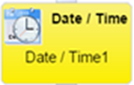
Date/Time
Presents a date/time picker to the user and have the selected date/time or selected time range be made available as output.
For more information, see Defining a Date/Time Control.
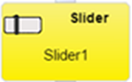
Slider
Presents a slide control to the user from which to select a single numeric value.
For more information, see Defining a Slide Control.
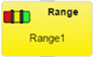
Range
Presents a slide control to the user from which to select a numeric value range. It differs from the Slider block as it can provide two values instead of one. It can also be used to assign colors to ranges in grids, gauges, bubble diagrams, and maps
For more information, see Defining a Range Control.
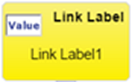
Link Label
Can show a combination of static and/or dynamic text, and optionally provide a web link when clicked on. It can display as simple text or as a button.
For more information, see Defining a Link.
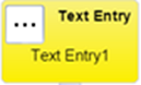
Text Entry
Displays a field into which users can type text to be used as an input to another object.
For more information, see Defining a Text Entry.
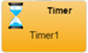
Timer
Generates an event at a specified interval,that can be used to refresh other blocks, like the Query Data block or the Date/Time block.
For more information, see Defining a Timer Control.
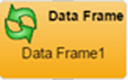
Data Frame
Transforms a data block by transposing row values into one or more columns, or condensing multiple column values into a single column. Useful for creating array columns that cal display Sparkline visualizations.
For more information, see Defining a Data Frame Control.
Data Filter
Filters the input of a data block and makes the results available as the output of the Data Filter block.
For more information, see Defining a Data Filter.
Focus Bar
Provides a way to zoom into a subset of data.
For more information, see Defining a Focus Bar Control.
Visualization Objects
The following sections explain the available visualization objects.
Grid
Provides a way to show tabular or hierarchical data in grid.
For more information, see Defining a Grid.

Chart
Shows data in standard graph formats such as line, bar, column, pie, and area.
For more information, see Defining a Chart.

Gauge
Provides a way to highlight a single numerical value, such as CPU usage. Can attach a Slider to control ranges and colors.
For more information, see Defining a Gauge.

Horizon Graph
Presents area graphs in a compact manner. Horizon graphs require a numerical or date-based domain and a numerical range, and are best used to show patterns and exceptions over a set of data.
For more information, see Defining a Horizon Graph.

Sankey Diagram
Shows volume flow between entities. Each entity is displayed as a rectangle, with the link between two entities having a width proportional to its value.
For more information, see Defining a Sankey Diagram.

Heat Chart
Shows a single data dimension using two axes in a circular layout. This type of chart is useful for showing cyclic data such as hours of the day during the week and makes it easy to identify clustered data values such as periods of peak usage.
For more information, see Defining a Heat Chart.

Map
Used to display maps with color-coded markers at specific latitude and longitude locations, or color-coded countries or regions.
For more information, see Defining a Map.
Bubble Diagram
Used to clearly shows relative relationships between data values, for example file sizes or number of hits on various web sites. If the data is hierarchically ordered, the Bubble Diagram can also show the parent/child relationships, such as applications that make up a package.
For more information, see Defining a Bubble Diagram.

Matrix
Shows a series in a block-based matrix to display and view data points in relation to others. The bound data must have one column for the name values, and one or more columns that define the series, or axis data values. The output from the matrix will be the set of rows matched against the matrix-selected object names.
For more information, see Defining a Matrix.
Dash Link
Displays a visual representation of another dashboard that links to the selected dashboard when clicked on by the user.
For more information, see Defining a Dash Link.
Web Page
Allows the display of an external web page by entering a relevant URL.
For more information, see Defining a Web Page Link.

Node Graph
Allows you to display hierarchical data in a node based format.
For more information, see Defining a Node Graph.
![]()
Comment
Allows you to enter comments about the design and construction of the dashboard onto the Dashboard. The comments are only visible in Dashboard Builder and have no impact on the display of a dashboard.
For more information, see Defining a Comment.

On This Page