Define a Map
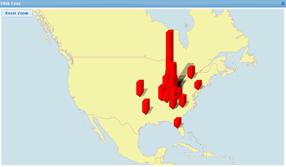
The Map block allows you to display data on a map with color-coded markers at specific latitude and longitude locations (as shown in the example below), or color-coded countries or regions.
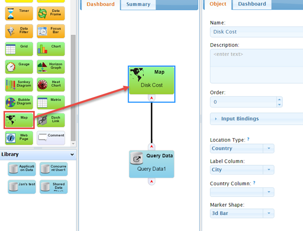
- Drag a Query Data block to the workspace and define the Query Data block as necessary.
- Drag the Map block from the Toolbox into the workspace.
- Link the Query Data block with the map by connecting the Query Data block’s output port to the map block’s input port. Once you do this, the Column Properties section will be available for selection in the Map block's Properties.
-
Optionally, Name the Map block and provide a Description. The name will appear in the map pane’s title bar when the dashboard is viewed.
- Optionally, supply an Order for where on the Dashboard you want the map to display.
NOTE: The SysTrack Dashboard Viewer allows you to move most objects and save the layout, but the Order parameter places the objects initially.
-
Choose how you want data displayed on the map by selecting one of the following options from the Location Type field's drop-down list:
- Latitude/Longitude shows data displayed as colored markers at locations specified by latitude and longitude
- Country shows data by coloring entire countries
- State/Province/Region shows data by coloring country subdivisions using the two letter postal code as the ID
Display Data by Latitude and Longitude
If you selected Latitude/Longitude as the Location Type the following fields display:
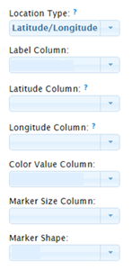
- From the Label Column field's drop-down list, select the label for the column data you wish to display when hovering over markers on the map.
- From the Latitude Column field's drop-down list, select the column that contains the location's latitude in decimal format (e.g. 40.77)
- From the Longitude Column field's drop-down list, select the column that contains the location's longitude in decimal format.
- From the Marker Size Column, select the column that contains the data that will visually be represented by marker size.
- From the Marker Shape field's drop-down list select the marker shape you wish to display (options include: Circle, Cross, Diamond, Square, Triangle, Bar, and 3d Bar)
- When you are done, click the Apply button to save your changes.
Display Data by Country
If you selected Country as the Location Type the following fields display:
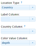
- From the Label Column field's drop-down list, select the label for the column data you wish to display when hovering over countries on the map.
- From the Country Column, select the column that contains the two-letter ISO 3166 country code.
- From the Color Value Column, select the data column you for which you wish to display color values.
- When you are done, click the Apply button to save your changes.
- To display color gradients attach and set up a Range Slider Control. See Defining a Range Control for more information.
Display Data by State/Province/Region
If you selected State/Province/Region as the Location Type the following fields display:
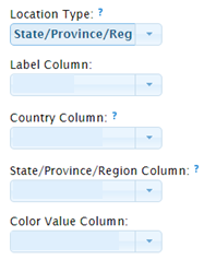
- From the Label Column field's drop-down list, select the label for the column data you wish to display when hovering over State/Province/Regions on the map.
NOTE: The State/Province/Region setting currently only supports US States and Canadian Provinces.
- From the Country Column, select the column that contains the two-letter ISO 3166 country code.
- From the State/Province/Region Column, select the column that contains the two letter postal code ID representing the subdivision of a country.
- From the Color Value Column, select the data column you for which you wish to display color values.
-
When you are done, click the Apply button to save your changes.
- To display color gradients attach and set up a Range Slider Control. See Defining a Range Control for more information.
On This Page